How to Find the Right Background Images for Your Author Website by Nate Hoffelder
 Today we welcome a new guest writer to Writer’s Fun Zone, Nate Hoffelder who is stopping by to chat with us about “How to Find the Right Background Images for Your Author Website.” Enjoy!
***
A picture is worth a thousand words, and nowhere is that more true than the images on an author website.
Choose the right images and you will tell your visitor what you write about, grab their attention, and get them interested in finding out more about your work.
Background images are the ones that live behind the site content and may be the same for the entire site or change, depending on which page you’re on.
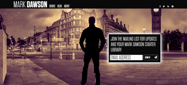
Good examples of site background images
Your Background Images
But if you choose the wrong images, visitors will leave in either frustration or disinterest.
Choose the wrong background image and visitors will assume you write in a genre different from what you actually write in, or even worse, they might not even stop to wonder what you write about before they leave.
I have a system for choosing background images for a website, and I would like to share it with you.
* * *
When it comes to using background images, the first thing you need to know is that background images need to stay in the background. If they take your eye away from the text, it’s a sign of a poor design which needs to be fixed.
I use two terms to describe background images that distract attention from the text: “Busy” and “Noisy”.
Let’s look at “Noisy” first.
Noisy Background Images
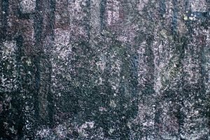
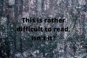
I use this term to describe images that have a lot of detail but not much activity or content. This type of image is a problem because it can distract the reader’s eye from the text.
For example, if you used the following image as a background, readers might not even notice the text.
While there have been a few “noisy” images that I’ve managed to tweak, I have found that a “noisy” background image generally needs to be replaced. I have never had much luck in “reducing” the noise, which is why I believe that it’s better to start with a good image rather than try and fix a bad one.
“Busy” images, on the other hand, can be used – if you are careful about it.
Busy Background Images
I use this term to refer to images that have a lot of action that can distract from, or otherwise might be more interesting than, the text sitting in front.
For example, if you look at the images below you will notice that the text in the first image is easy to miss.
The second and third images show two ways to fix this issue.
One of the details you should notice in the latter two images is the location of the text.
I put it on the left on purpose because it acts as a balance to the figure in the image. It looks symmetrical, which is pleasing to the eye.
I bring this to your attention because that is a design concept you will need to know when you start making background images.
Speaking of which, I should probably tell you how to find them.
How to Pick the Best Stock Photos for Your Background Images
When it comes to using stock photos, we are blessed with an infinite number of choices.
There are many sites with free images (I even have a post on this topic and there are dozens of sites that license stock photos.
The supply is near infinite, but which ones do you choose?
For starters, you should avoid any images that look either busy or noisy. (See? That’s why I covered these concepts first.)
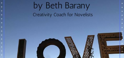
You should also be wary of “unbalanced” images. This is my term for images with colors or brightnesses that vary wildly between parts of the image.
Here’s one example:
While I could make this work as a background image, I tend to avoid unbalanced images because they are really hard to work with.
For example, if I wanted to put text on the image, do I use white text, which will disappear in the bright spots, or do I use black text, which will disappear in the dark spots?
I just think it’s a better use of my time to instead look for images that have fewer flaws.
If you want advice on what to look for, I think you should look for inspiration.
Look for Inspiration for Your Images
Start by using a stock photo site’s search feature to find images based on either your genre, your non-fiction topic, the geographic location mentioned in your books, or some other detail related to your works.
If you write fiction, browse the search results, and look for images that make you want to write about your main character, their background, or their story.
For non-fiction, look for images that remind you of your topic.
Any image that makes you think of your story or topic is an excellent candidate for use as a background image. You should try to find ten to fifteen images. (More is always better.)
The reason you want as many images as you can find is that the next step is to get a second opinion.
Get A Second Opinion
Find one or members of your intended audience, and ask them if they can see the same things you see in the images.
The thing about these images is that they need to send a message.
If your audience isn’t receiving the same message you think you are sending, then you should find out why, and try again.
Once you have confirmed that the images send the desired message, it’s time to download the images.
Most sites will offer you a variety of image sizes. I would recommend that you choose an image size that is 2,000 to 4,000 pixels wide.
This is wide enough to work with the majority of monitors while at the same time avoiding incredibly large file sizes.
* * *
Next Step: Edit Your Images
Now that you have chosen the images, the next step is to edit them so they can be used as background images. Alas, this topic would fill a blog post all by itself, so I will have to leave it for another time.
***
About the Author
 Nate Hoffelder has been building and running WordPress sites since 2010. He blogs about indie publishing and helps authors connect with readers by customizing websites to suit each author’s voice. His site, The Digital Reader, has been mentioned in the New York Times, Forbes, BoingBoing, Techcrunch, Engadget, Gizmodo, and Ars Technica. Subscribe to his blog for tips on book publishing, WordPress, related web tech, and author websites.

