Use This Checklist to Evaluate the Brilliance of Your Interior Designer: How to Spot a Professional by Mary Neighbour
 Please welcome back guest author Mary Neighbour as she shares with us “Use This Checklist to Evaluate the Brilliance of Your Interior Designer: How to Spot a Professional.” Enjoy!
***
 Of all the professionals discussed in these blogs, an expert interior book designer may be the hardest to spot, for the reason mentioned in an earlier blog: good interior design remains invisible to the average reader.
Moreover, the scope of knowledge needed to call oneself a professional in this arena is quite broad.
To help you identify the diamond from the cubic zirconia, use this checklist to evaluate the brilliance of your interior designer.
If you can’t tick off an item, then there’s likely a problem you’ll want to discuss with your layout artist.
Your Checklist on How to Spot a Professional Interior Book Designer
- Blank pages are truly blank. They do not display running headers or footers.
a. In addition, blank pages sometimes are required to be inserted, such as in the front matter, where all pages (except the copyright page) should start on the right side of a spread.
Tip: Whether or not a blank page should precede the start of a new chapter is a matter of choice that needs to be consistently implemented. - Centered lines should be anchored at the middle of the text block (not of the page).
- Chapter headings and subheads need consistent white space above and below them. They also have consistent font size, attribute, and capitalization style.
- End-of-line spacing: a number of factors contribute to what typographers call “a bad break,” and these require manual adjustment.
Recommended: You don’t need to know all the intricacies of line breaks. Simply take note of whether the right-hand margin of text looks overly ragged, inconsistently spaced, or overly punctuated — to the point of being distracting. - Indents:
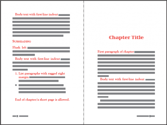
a. The first line of a chapter is flush-left; that is, it has no indentation.
Subsequent body-text paragraphs typically have a slight, first-line indentation.
b. The first line following a subheading is flush left.
c. The first line of a block-indented paragraph is flush-left.
Subsequent block paragraphs may be slightly indented.
d. A block-indented paragraph should be indented at the right margin as well as at the left margin.
e. A list paragraph should be indented at the right margin as well as at the left margin.

- Hyphenation: the rules about hyphens are lengthy and technical. Never hesitate to ask your interior book designer a question about something that looks “off.” Three common errors are:
a. Incorrect hyphenation of an already-hyphenated phrase.
b. Using a hyphen mark to break a URL.
c. Having hyphens at the ends of three or more consecutive lines. - Justification: most text will be justified along both the left and right margins. Block-indented and list paragraphs, though, are often ragged on the right margin.
- Margins:
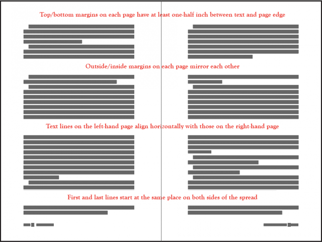
a. All margins need a minimum of one-half inch between the text block and the trimmed edge of the sheet.
b. Inside margins (the gutter) invariably are wider than the outside margins.
c. Outside and inside margins “mirror” each other on a spread; e.g., the left-hand margin of a left-hand page equals the right-hand margin of the right-hand page. (See image below.) - Page numbers: odd numbers always appear on a right-hand page (even numbers are on the left).
Tip: Because adjustments may be made to the layout on a second round, always check to be sure that the page numbers in the table of contents correctly reflect the beginnings of chapters and subsections. - Spreads: two facing pages are called a spread. When looked at as a single element, a spread should be horizontally aligned so that the tops and bottoms of each half begin and end at the same point on each page. Moreover, lines of text on the left should align across the spread with the lines on the right. The appearance of subheadings, images, tables, or lists may interrupt this alignment, but the first and last lines should still be perfectly even.

- Widows and orphans: in current usage, these terms apply to lines as well as to words. There are a few exceptions to the following rules. Ask your typographer about any instances that appear in your layout.
a. A single line of a paragraph should not sit alone at the bottom or top of a page;
b. A single word should not sit alone on the last line of a paragraph. - Dashes: a typographical dash is a horizontal stroke between words (or figures) to indicate a range or create a pause. There are two widths, both of which are longer than a hyphen, and a professional typographer will use each appropriately. Conventionally, no space precedes or follows either type of dash.
a. En dashes are approximately the width of the letter “n,” and they are chiefly used to denote a range of numbers, such as dates, times, scores, etc.
b. Em dashes are approximately the width of the letter “m,” and their use is more versatile. Em dashes can signify a sudden break in the text, emphasize words or a phrase, or function in place of parentheses, commas, or colons.
Use This Checklist
I hope this list serves as a sort of microscope that amplifies and demystifies what you’re looking at when you scrutinize typography.
When you have a sample layout to review, compare it to this list and have a thorough discussion with your designer that shows you have done your due diligence.
Next week in this series: “Questions to Ask before Hiring Your Interior Book Designer.”
The following week: We will begin our final series of blogs, which will address hiring a professional to guide you through the production process of self-publishing your book.
***
ABOUT THE AUTHOR
 Some call Mary E. Neighbour a “book shepherd,” though Mary wields a blue pencil far more expertly than a herding rod. For the past ten years, she and her husband have helped dozens of writers bring their manuscripts to the marketplace, through MediaNeighbours, their publishing services business.
Passionate about helping authors make their work shine in the world, with a combined professional expertise of over 50 years in editing and design, this family team is one you’ll want to adopt as your guide through the challenging world of independent publishing.
Mary’s other passion is learning about the history of slavery and how it impacts race relations today. She incorporated much of her research into her novel, Speak Right On: Conjuring the Slave Narrative of Dred Scott

