Balancing Genre Expectations With Standing Out: Book Covers by Linnea Gradin
 Today we welcome a new guest writer to Writer’s Fun Zone, Linnea Gradin who is stopping by to chat with us about “Balancing Genre Expectations With Standing Out: Book Covers.” Enjoy!
***
Book covers are vital for the success of a book as they guide readers and let them know what to expect.
An attention-grabbing cover is great, as long as it accurately reflects the story.
For example, people looking for romance don’t want the love interest brutally murdered on page 3.
A successful book cover toes the line between standing out and fitting in.
Let’s look at what that means.
Covers convey important information
In order to create a book cover that stands out, you must first know the expectations of the market– and the genre.
Motif
Browse retailers to find out what motifs big publishers are using for your genre or subgenre.
Think both about what is physically on the page, and what is more abstractly communicated.
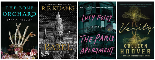
Does the cover feature a dark and desolate landscape, or some kind of tool that draws your mind to isolation and gruesome acts? Chances are it’s a crime thriller.
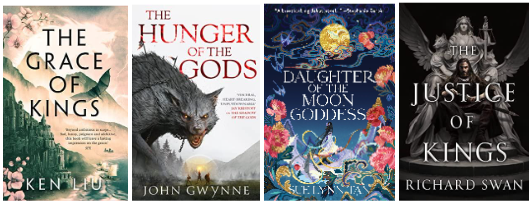
Are dragons, swords, or an imaginary world portrayed? Probably fantasy.
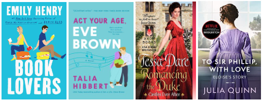
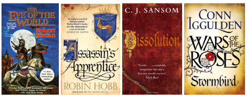
Illustrated human figures hint at contemporary romance, while period costume is a sure sign of historical romance.
You get the gist.
Some motifs are more subtle than others, so take some time to explore trends and save your favorite covers to send to future book cover designers as inspiration.
Typography
You can also find genre trends in typography.
Expect to see more elaborate fonts for fantasy and some types of historical fiction, for instance.
Color scheme
Lastly, color scheme is used to capture the mood of a book or appeal to a certain audience.
Dark covers hint at creepy or thrilling content which may involve murder, fantastical beings, or suspense.
Though dour, they pop with details like gold foiling or contrasting colors for the title.
These vibrant colors, on the other hand, signal cozy, contemporary, bold, or even lighter-hearted reads.
While you may be tempted to use bright colors because they pop on the shelf, it’s probably not the way to go if you’ve written something dark and gritty.
Your target audience is likely to dismiss it, and vice versa!
Let’s look a bit closer at how you can work within these genre conventions.
To subvert, or not subvert?
Once you have a good idea of the trends in your specific genre– its contours– it’s time to decide how you want to paint within those lines, or indeed outside them.
If you’re writing a memoir, for example, research will tell you that many of the best memoirs and biographies tend to have clean, simple covers featuring photographs– often from childhood or iconic moments– and emphasize typography.
With that in mind, you can focus on one or two things to make your cover stand out among the rest.
Take the cover of Why Didn’t You Tell Me?
The peeling photograph indicates that it belongs in the memoir genre, and the handwritten font creates an intimate feeling– as if we’re invited to read Wong’s old diaries.
It meets the target audience’s expectations while choosing a bold color and otherwise minimalist design.
Likewise, Picasso’s War playfully uses primary colors, coincidentally red again, to draw the eye and a font that references Picasso’s own signature for authenticity. But it stays well within genre conventions with its simple design and photograph of the artist.
It’s immediately clear that this is a biography, not a work of fiction.
On the other hand, Ingrid Rojas Contreras memoir goes against the grain with its abstract and busy design.
On a closer look, the reader will see that it still pays homage to genre convention by incorporating old photographs and newspaper clippings, successfully standing out while fitting in.
Finally, a second iteration of Jo Nesbø’s The Snowman also shows possibilities to play within the margins of the crime genre, keeping the dark color scheme but cleverly playing with minimalism and form.
Same ominous feeling, different method.
All four of these covers manage to balance expectation with individuality, to different degrees.
Takeaway
Ultimately, there’s no formula for how much you should deviate from convention, but it’s important that the cover matches the content.
After that, you can start thinking about ways to stand out — whether that be bright colors or a slightly off-balance composition that makes readers look twice.
***
ABOUT THE AUTHOR
![]() Linnea Gradin writes about writing and publishing over at Reedsy — a website that connects authors with publishing professionals and gives tips on topics such as how to self publish a book or how to translate a book.
Linnea Gradin writes about writing and publishing over at Reedsy — a website that connects authors with publishing professionals and gives tips on topics such as how to self publish a book or how to translate a book.


