Introduction and Terminology on How to Spot a Professional Interior Book Designer by Mary Neighbour
 Please welcome back guest author Mary Neighbour as she shares with us “Introduction and Terminology on How to Spot a Professional Interior Book Designer.” Enjoy!
***
 If you read a book from cover to cover and remain unaware of the book’s interior design, then that typesetter has accomplished one of the cardinal rules of layout: don’t interfere with the reading experience.
While your cover artist endeavors to dazzle, your interior designer aims to be inconspicuous, belying the amazingly complex tasks of interior layout.
No wonder, then, there is a bit of mystery about what makes for a good book interior.
To demystify this process, let’s start with the terminology.
Interior design refers to the overall planning and execution of elements pertaining to typography and page layout.
Pieces of the puzzle include the sizing, spacing, and positioning of text and images on the page.
Every detail should serve ease of reading and comprehension.
Following are important terms—split into “broad concepts,” “technical jargon,” and “layout terms”—that will illuminate what to look for in a professional interior book designer.
(For an elegantly visual glossary of typography, visit Canva.com, an online graphic-design tool.)
Broad Concepts Your Interior Book Designer Uses
Typography: A comprehensive term pertaining to all aspects of the style and appearance of a page of printed matter. It may also refer to the manner of production. Any error in the style, appearance, or production of an element on a page is a “typo.”
Type: A printed letter or character. Subcategories of type include display type—larger than body type and used for headings and titles—and body type, used for text paragraphs.
Font: A set of type of a unified design, size, and weight. Two main categories of fonts are serif—characters with a finishing, projecting line or stroke—and non-serif, which have no extending features. Below, the serif font is “Mrs. Eaves XL Serif Bold,” and the non-serif is “Lucida Grande Bold.”
![]() Typeface, or “font family”: Frequently used synonymously with “font,” typeface more specifically refers to multiple fonts in a single design set.
Typeface, or “font family”: Frequently used synonymously with “font,” typeface more specifically refers to multiple fonts in a single design set.
For example the Lucida font family includes many faces—serif and non-serif—such as blackletter, calligraphy, and handwriting, to name a few.
Technical Jargon Your Interior Book Designer May Use
Glyph: A character or symbol, either esoteric or ornamental. Many font families come with a set of glyphs that are styled for that font.
Justify: Aligning the margins of the type. Most text will, by default, be aligned at the left margin. Usually, a “justified paragraph,” then, refers to aligning the right margin. (Otherwise, it is “ragged.”)
Kerning: Adjusting the space between a specific pair of characters in a word. Well-designed body-text fonts typically don’t need manual kerning, but display fonts often need tweaking.
Leading: also called “line spacing”: Refers to the adjustment of space between lines in a paragraph and between paragraphs.
Ligature: Ligatures are a single character representing two characters. Because some letter combinations produce awkward spacing problems, like f-i (where the ball of the F may overlap the dot of the I), ligatures are created to solve the problem.
Pica: A typographic measure corresponding, in America, to one-sixth of an inch. Picas are further divided into points (see below).
Point: A unit of measure commonly used to refer to font height, but it can also pertain to line spacing and other measurements on the page.
Tracking, also called “letterspacing”: Similar to kerning, but pertaining to the consistent spacing of all letters within a line or a block of text.
Layout Lingo that May be Used by Your Interior Book Designer
 Copy block: Lines of text treated as a single element in the design or page makeup.
Formatting: Applying any of a variety of attributes to text, such as typeface, size, weight, italics, bold, etc.
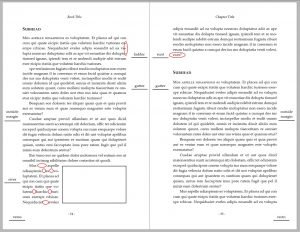
Gutter: The blank space between facing pages in a spread, also referred to as “inside margins.” Care must be taken in establishing the size of the gutter, as the manner of binding will encroach upon some portion of the gutter.
Ladder: The resulting visual effect of multiple hyphens in close proximity at the ends of lines of text. As this presents a distraction to a reader, ladders should be avoided.
Margins: The blank space around the type area of the page: top, bottom, inside, and outside (see also “gutter”).
Page layout: Once the interior design is established, the elements of that design must be executed consistently—by character, word, line, paragraph, and page—in the layout process.
Orphans and widows: Nowadays used interchangeably, these refer to a single line of a paragraph appearing alone (i.e., separated from the rest of the paragraph) at the bottom or top of a page. Recently, the Chicago Manual of Style has okayed the occasional single line at the bottom of a page—but never at the top of a page, unless it is a single-line paragraph, as in dialogue.
River: The resulting visual effect of uneven gaps between words in a paragraph. Often this occurs in a paragraph of a short span, as when the paragraph is beside an image. Because these gaps tend to lead the eye away from reading, they should be avoided.
Recto: A right-hand page of a book. (See also “verso.”) The recto page number is always an odd number.
Running headers and footers: Items of text that appear at the top or bottom of each page, such as book title, author, and page number (also called “folio”). To facilitate navigation in a nonfiction book, a chapter title might be included.
Runt: The last line of a paragraph that is short, either because it is a single word or two short words. Convention dictates that runts be avoided.
Spread: Two facing pages of a book. Typically, a spread should be “balanced,” meaning that they begin and end at the same point on each page.
Trim size: Many trade books, particularly paperbacks, measure nine inches high by six inches wide. Thus, the trim size—the dimensions of the finished book—is six by nine inches. There are a multitude of standard trim sizes and others that are “custom.”
Verso: A left-hand page of a book. (See also “recto.”) The verso page number is always an even number.
In sum, the terminology above—just a smattering from a more extensive vocabulary—illustrates how numerous are the tasks of interior book design.
Your typesetter’s workflow is complex, though there are software tools available to keep all the moving parts from becoming muddled or intruding upon the reading experience.
Tip: Software alone can’t do it all. Not only must a layout professional know how to use the software’s tools, they must also know the complex rules and standards of interior book design so that they can pay attention to every detail.
Next week in this series: “Interior Design Standards.”
The following week: “Telltale Signs Your Layout Artist Is a Professional.”
***
ABOUT THE AUTHOR
 Some call Mary E. Neighbour a “book shepherd,” though Mary wields a blue pencil far more expertly than a herding rod. For the past ten years, she and her husband have helped dozens of writers bring their manuscripts to the marketplace, through MediaNeighbours, their publishing services business.
Passionate about helping authors make their work shine in the world, with a combined professional expertise of over 50 years in editing and design, this family team is one you’ll want to adopt as your guide through the challenging world of independent publishing.
Mary’s other passion is learning about the history of slavery and how it impacts race relations today. She incorporated much of her research into her novel, Speak Right On: Conjuring the Slave Narrative of Dred Scott


