The Foundations of a Compelling Book Cover by Simone Collins Co-Founder of ArtCorgi.com
 Let’s welcome back columnist Simone Collins as she shares with us “The Foundations of a Compelling Book Cover.” Enjoy!
***
People who urge you to not judge a book by its cover are engaged in a futile battle against a core element of humanity: the fact that we are designed to make snap judgments based on people and objects’ outward appearances.
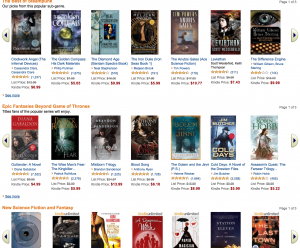
Your book cover matters a great deal, especially when it has to vie for attention amidst a sea of other books within a bookstore or set of Amazon Kindle results.
I help authors commission original art for book covers via my company ArtCorgi.com and its specialized author boutique, ArtforAuthors.com. When we work with authors, we make a point of ensuring that the following foundational elements are present in the cover’s design.
Unique Coloring
 If you look at an all-brick wall that has one bright blue block, your eyes will be drawn to that block. What matters more is that the block is blue and not red, not that it is brightly-colored.
People have more or less figured that out that colorful book covers can draw attention, so you will not be able to stand out just by incorporating bright hues into your cover art. Consider optimizing for:
- Bold contrast (it is even OK if your cover is black and white if it has eye-catching contrast)
- Simpler, larger shapes (that stand out well in thumbnail form)
- Unique (but clear) lettering
Emotion
Spend five minutes flipping channels on TV or browsing through viral online content and you will find we are drawn to emotion. Consider how you can work strong emotions into your book cover through the use of color, objects, stylized lettering, framing, and perspective.
Be tactful about the particular emotion you want your book cover to evoke when people glance at it. People looking for a good romance novel are not going to be seduced by a book cover that evokes feelings of disgust. People looking for a horror novel are not likely to find a joyful-feeling book cover to be all that compelling.
Faces
 One of the easiest ways to evoke specific emotions is to feature close-up faces on the cover of your book. It helps if those facial expressions happen to play across particularly attractive visages.
By incorporating a face (or faces) into your book cover, you can capture potential readers’ attention with the promise of a compelling character. Think about it this way: would you rather read a book about words (a title) or a vague scene (a more zoomed-out painting, photo, or illustration), or would you prefer to read a book about an amazing personality (a person’s face)? Nothing reflects personality in a short period of time quite like a face.
Unanswered Questions
People are more likely to click through on content online if they want the answer to a question. What did [insert random celebrity name] do that horrified his/her fans? What is that secret diet trick that doctors and fitness trainers hate?
Consider how you can build a compelling, unanswered teaser into your cover art. You might work it in as an optical illusion- something that makes the potential reader do a double take. You might depict an unexpected juxtaposition, like a bloody knife next to a cup of tea. Or you might show just part of a full scene- enough to show potential readers that something interesting is going on… but they will have to buy your book to find out more.
Resources
For more inspiration, I recommend swinging by a blog post written by Moz on the ideation process they follow when developing content with a high potential to go viral http://moz.com/blog/want-a-viral-hit-here-is-an-inside-look-at-our-ideation-process. That process of ideation can help you think through elements about content- be it written or visual- that people find to be compelling.
Should you like help with color design, I am happy to help. Swing by ArtforAuthors.com, tweet at @ArtCorgi or @SimoneHCollins, or ping me at Simone (at) ArtCorgi.com.
***
ABOUT THE AUTHOR
 Simone Collins is co-founder and COO of ArtCorgi.com, an online marketplace that connects everyday people with up-and-coming artists who can illustrate anything imaginable. Before becoming an entrepreneur, Simone was Director of Marketing at HubPages, one of the world’s largest online publishing platforms for freelance writers, where she managed a large community of active and aspiring novelists and writers.


